I am happy to report a package from Goldspot arrived at the office on Friday. Inside was my Visconti nib with a newly fitted section, which had been missing in the initial shipment, which I first mentioned in this post. So I can finally give a complete review of the Visconti Rembrandt Calligraphy Set in Red.
The box in which the calligraphy set originally arrived.
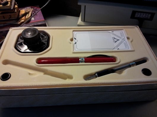
The set came with an inkwell, blotting paper, the pen body, two converters and two nibs. In this picture the extra-fine nib is in the pen, while the italic nib with it’s new section is lying in its bed as it should be, nice and snug, instead of rolling around.
The booklet that came with the set not only gives instructions on filling the pen but also introduces the various types of calligraphy: Italic, Gothic, Uncial, Foundational, Rotunda and English Script. There are detailed pictures of how to produce each letter.
I think my favourite is Foundational, which is the third up from the bottom.
Makes it look easy! I wish.
A close-up of the blotting paper. Apparently it has a plastic coating to protect fingers.
The inkwell. This one is plastic; they also come in glass bottles. Beautiful shape to the bottle; very distinctive. And inadvertently I got a great closeup of the pen. Love the variation in the barrel colour, the decorated band and the iconic clip.
The pen body came wrapped in this plastic sleeve. No doubt about where it was made.
The finial.
Close-up of the detail on the band. So pretty. The other side says Rembrandt.
Sorry couldn’t resist the cap again – love it!
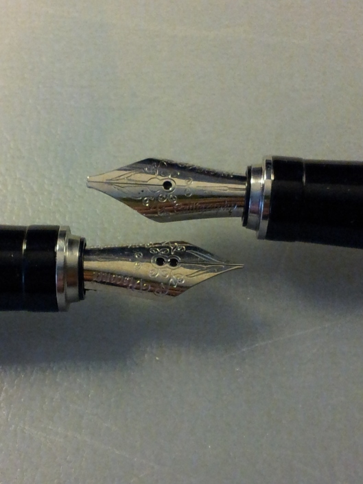
The nibs; italic on top, extra-fine on the bottom.
I filled the pen with the Visconti black ink and wrote this sample with the 1.5 mm nib. Very smooth on the Studio Oh! paper. A little too thick for everyday use I think. I will use it for my Christmas cards and special occasions. Now I have to find a red ink I don’t get a headache looking at. But until then…
I’ve had this J. Herbin Orange Indien since my Christmas visit to Reid’s Stationers. When I saw the orange undertones of the Rembrandt barrel I immediately thought of my only orange ink. I think it’s a good match.
Such a difference to the first nib. It is a very nice writer, with no skipping. It was a bit scratchy on the paper (Clairefontaine) but that’s to be expected with an extra-fine nib. I had to force some ink into the section to get it going but after that no problems. I think this will be more of an everyday writer for me.
I know this is the “budget” version of the Rembrandt, as the one I tried out at Reid’s Stationers had a metal section (not plastic) and a magnetized finial that could be customized. But that really doesn’t matter to me; this version brought it into the realm of possibility and I am thrilled with it. I am very grateful to my husband for buying it for me and also to the excellent folks at Goldspot for making it perfect. You can check it out yourself here, although it is no longer on sale. And if you really want to dream, take a look a the rest of the Visconti line here.


Pingback: Parker Vector Calligraphy Set | inlovewithjournals